Fixing Marvel's Color Grading

  • 62 results
  • 1
  • 2
Avatar image for loyngulpany
loyngulpany

3684

Forum Posts

0

Wiki Points

0

Followers

Reviews: 0

User Lists: 0

I will post some pictures from MCU movies that I color corrected. I can only post pictures and not videos because I have no software for color grading. Marvel's movies are a bit dull looking but they shouldn't be because they have colorful sets and costumes. Marvel movies lack contrast and saturation that's why the colors don't pop.

No Caption Provided
No Caption Provided
No Caption Provided

Avatar image for hemehero
Hemehero

1326

Forum Posts

0

Wiki Points

0

Followers

Reviews: 0

User Lists: 0

This looks awesome, but I feel it would completely change the tone of the mcu

Avatar image for loyngulpany
loyngulpany

3684

Forum Posts

0

Wiki Points

0

Followers

Reviews: 0

User Lists: 0

#3  Edited By loyngulpany

@hemehero said:

This looks awesome, but I feel it would completely change the tone of the mcu

Well, to be honest the tone of the MCU doesn't really matter to the color grading. The color grading can look amazing if it's done well. Take a look at The Dark Knight, the Netflix shows, the DCEU movies, Lord of the Rings, Star Wars. All of those have vibrant color palettes despite the different tones. Even Logan has a more vibrant color grading than any MCU movie. I know this is a small detail but it's also important.

Avatar image for payneintheass
PayneInTheAss

15202

Forum Posts

0

Wiki Points

0

Followers

Reviews: 0

User Lists: 0

I´m no expert, but I can say that the first two don´t look good or natural

Only the third.

Avatar image for loyngulpany
loyngulpany

3684

Forum Posts

0

Wiki Points

0

Followers

Reviews: 0

User Lists: 0

@hemehero: Take note that The Dark Knight, Logan and the Netflix shows were dark and gritty but still they have more colors than any of the MCU movies.

Avatar image for loyngulpany
loyngulpany

3684

Forum Posts

0

Wiki Points

0

Followers

Reviews: 0

User Lists: 0

I´m no expert, but I can say that the first two don´t look good or natural

Only the third.

Okay thanks for pointing out. I will improve it

Avatar image for loyngulpany
loyngulpany

3684

Forum Posts

0

Wiki Points

0

Followers

Reviews: 0

User Lists: 0

The colors looked washed out in every MCU movie.

Okay i'll add some more here:

No Caption Provided
No Caption Provided
No Caption Provided

Avatar image for cryomodeste5
CryoModeste5

494

Forum Posts

0

Wiki Points

0

Followers

Reviews: 0

User Lists: 0

That`s not fixing , that`s just recoloring

Avatar image for loyngulpany
loyngulpany

3684

Forum Posts

0

Wiki Points

0

Followers

Reviews: 0

User Lists: 0

Avatar image for loyngulpany
loyngulpany

3684

Forum Posts

0

Wiki Points

0

Followers

Reviews: 0

User Lists: 0

That`s not fixing , that`s just recoloring

How so?? Bro look at the original colors it really looks greyish and dull. I just fixed it with minor adjustments. Say what you want about DC's desaturated colors atleast it has vibrant colors and higher contrast than any MCU movies. Watch Lord of the Rings and Harry Potter look at the color grading of those movies it was stunning right? So we don't need to fix it.

Avatar image for cryomodeste5
CryoModeste5

494

Forum Posts

0

Wiki Points

0

Followers

Reviews: 0

User Lists: 0

@cryomodeste5 said:

That`s not fixing , that`s just recoloring

How so?? Bro look at the original colors it really looks greyish and dull. I just fixed it with minor adjustments.

First , Second and Spidey`s fixed pic are weird. As Payneintheass said it doesn`t look natural and try to fix them with cold colors and not like this

Avatar image for adamtrmm
adamTRMM

10933

Forum Posts

0

Wiki Points

0

Followers

Reviews: 0

User Lists: 0

No Caption Provided

Now this "after" really does look much better. On other ones colors are a bit too much.

Avatar image for loyngulpany
loyngulpany

3684

Forum Posts

0

Wiki Points

0

Followers

Reviews: 0

User Lists: 0

@loyngulpany said:
@cryomodeste5 said:

That`s not fixing , that`s just recoloring

How so?? Bro look at the original colors it really looks greyish and dull. I just fixed it with minor adjustments.

First , Second and Spidey`s fixed pic are weird. As Payneintheass said it doesn`t look natural and try to fix them with cold colors and not like this

So colors are dull in real life for you?? I don't really see greyish colors in real life tbh

Avatar image for cryomodeste5
CryoModeste5

494

Forum Posts

0

Wiki Points

0

Followers

Reviews: 0

User Lists: 0

@loyngulpany:


No Caption Provided

I prefer dull , cold and gray colors other than this

Avatar image for loyngulpany
loyngulpany

3684

Forum Posts

0

Wiki Points

0

Followers

Reviews: 0

User Lists: 0

@loyngulpany:

No Caption Provided

I prefer dull , cold and gray colors other than this

So you prefer gray and dull colors instead of vibrant and exciting colors. I bet you didn't like the color grading of John Wick, Lord Of The Rings, any Wes Anderson movie, Wonder Woman, Star Wars, Spiderman 2, The Dark Knight, Logan etc.

Avatar image for loyngulpany
loyngulpany

3684

Forum Posts

0

Wiki Points

0

Followers

Reviews: 0

User Lists: 0

@adamtrmm said:
No Caption Provided

Now this "after" really does look much better. On other ones colors are a bit too much.

How about this one? Don't worry this is the same pic but different color.

No Caption Provided

Avatar image for adamtrmm
adamTRMM

10933

Forum Posts

0

Wiki Points

0

Followers

Reviews: 0

User Lists: 0

Avatar image for thespartanb345t
TheSpartanB345T

9376

Forum Posts

0

Wiki Points

0

Followers

Reviews: 0

User Lists: 0

Who cares, honestly. They've done better in some past movies, and dull grey has a visual tone in some cases.

Avatar image for loyngulpany
loyngulpany

3684

Forum Posts

0

Wiki Points

0

Followers

Reviews: 0

User Lists: 0

#21  Edited By loyngulpany

@thespartanb345t: A lot of people care. Tbh I can't find any movie that used dull grey colors besides MCU movies. Even The Matrix looks unrealistic because of the green color palette. Dull grey doesn't mean it's dark

Avatar image for cosmicmuffin
CosmicMuffin

497

Forum Posts

0

Wiki Points

0

Followers

Reviews: 0

User Lists: 0

Does it even matter? All I have to do is switch my TV setting to HDR and it makes the color contrast pop a lot more. It is very easy to fix, not a huge problem like everyone seems to say.

And besides, even without the HDR setting, Doctor Strange, Guardians Vol 1 and 2 (Especially 2), Ragnarok, Black Panther , Homecoming and Infinity War have shown to fix this issue. The vibrant colors pop so much, especially with the costumes in Black Panther, Ego's planet, Planet Sakaar, and all the different cosmic locations in Infinity War. You can tell a clear difference in phase 2 and phase 3 in terms of color

Avatar image for loyngulpany
loyngulpany

3684

Forum Posts

0

Wiki Points

0

Followers

Reviews: 0

User Lists: 0

@cosmicmuffin: Yes I usually switch my TV setting to vivid colors whenever I'm watching an MCU movie but if it's not an MCU movie I switch it back to standard color. Well tbh those films you mentioned still looks bland and I'm not color blind if you think dull grey makes it realistic go get some glasses then. BP has scenes were it was very dark to the point that I can't see almost everything. Ragnarok may have colorful visuals but the color grading was still grayish. Homecoming looks a bit dull. The only phase 3 MCU movie that has a little bit vibrant colors is GOTG Vol.2

Avatar image for thespartanb345t
TheSpartanB345T

9376

Forum Posts

0

Wiki Points

0

Followers

Reviews: 0

User Lists: 0

@thespartanb345t: A lot of people care. Tbh I can't find any movie that used dull grey colors besides MCU movies. Even The Matrix looks unrealistic because of the green color palette. Dull grey doesn't mean it's dark

Yes, but movies like CW and TWS go with themes of technology and surveillance, hence the greyish scheme.

Avatar image for heatforce
Heatforce

10141

Forum Posts

0

Wiki Points

0

Followers

Reviews: 0

User Lists: 0

I had no idea the MCU desaturated their colors. I always thought it was a DCEU thing but apparently not?

Avatar image for loyngulpany
loyngulpany

3684

Forum Posts

0

Wiki Points

0

Followers

Reviews: 0

User Lists: 0

@heatforce: It was also a DCEU thing but still it has more contrast and proper blacks than the MCU movies. I really don't know why they copy pasted the same color grading in every movie they made except for Iron Man, The Incredible Hulk, Thor and Iron Man 2. Those films I mentioned looks good because they were shot on film after that they shot all their films digitally.

Avatar image for loyngulpany
loyngulpany

3684

Forum Posts

0

Wiki Points

0

Followers

Reviews: 0

User Lists: 0

@thespartanb345t: I mean they don't have to be grayish or oversaturated to have good color grading. They just need to add more contrast so the blacks will become real black not dark gray

Avatar image for saberscar223
Saberscar223

4764

Forum Posts

0

Wiki Points

0

Followers

Reviews: 0

User Lists: 0

Spider-Man Homecoming looked Great

Avatar image for jujucrunk
JuJuCrunk

437

Forum Posts

0

Wiki Points

0

Followers

Reviews: 0

User Lists: 0

lol "fixing" Marvel's color grading. This should be called CHANGING Marvel's color grading to suit my preference. lol I personally love the Russos color grading. They just get it.

Avatar image for mickey-mouse
mickey-mouse

37138

Forum Posts

1

Wiki Points

0

Followers

Reviews: 1

User Lists: 4

In a way you aren’t wrong. But, the choices they made are done with a purpose. The MCU is an Action Comdey. Color choices like this make it into a cartoon and would turn off many adults sensibilities.

Avatar image for bruceveidt
BruceVeidt

3570

Forum Posts

0

Wiki Points

0

Followers

Reviews: 0

User Lists: 0

The thing with increasing contrast is that it negates ambient lighting and strengthens light sources.

In reality, light bounces off of all kinds of objects in the environment, which makes it so that shadows IRL are not as strong.

Avatar image for the_legendary_supersaiyan_hulk
The_Legendary_SuperSaiyan_Hulk

17515

Forum Posts

99

Wiki Points

0

Followers

Reviews: 0

User Lists: 0

No thanks, it all looks off.

Avatar image for loyngulpany
loyngulpany

3684

Forum Posts

0

Wiki Points

0

Followers

Reviews: 0

User Lists: 0

#33  Edited By loyngulpany

@jujucrunk: Lol if you prefer the grayish and dull colors you're color blind. Gray and dull doesn't make it realistic the image looks washed out or looks like a raw footage. Try again troll

Avatar image for loyngulpany
loyngulpany

3684

Forum Posts

0

Wiki Points

0

Followers

Reviews: 0

User Lists: 0

The thing with increasing contrast is that it negates ambient lighting and strengthens light sources.

In reality, light bounces off of all kinds of objects in the environment, which makes it so that shadows IRL are not as strong.

Yup definitely. Btw, good scientific explanation bro. No sarcasm intended

Avatar image for loyngulpany
loyngulpany

3684

Forum Posts

0

Wiki Points

0

Followers

Reviews: 0

User Lists: 0

In a way you aren’t wrong. But, the choices they made are done with a purpose. The MCU is an Action Comdey. Color choices like this make it into a cartoon and would turn off many adults sensibilities.

Umm what?? Can you explain how color choices would turn it into a cartoon? How would color grading turn off adults?? So when the film crew color graded Star Wars or Lord Of The Rings did they turn off adults because of that?? I don't understand. Even Wes Anderson's movies have no realistic colors it's always yellowish but still have proper contrast

Avatar image for loyngulpany
loyngulpany

3684

Forum Posts

0

Wiki Points

0

Followers

Reviews: 0

User Lists: 0

Avatar image for bruceveidt
BruceVeidt

3570

Forum Posts

0

Wiki Points

0

Followers

Reviews: 0

User Lists: 0

@bruceveidt said:

The thing with increasing contrast is that it negates ambient lighting and strengthens light sources.

In reality, light bounces off of all kinds of objects in the environment, which makes it so that shadows IRL are not as strong.

Yup definitely. Btw, good scientific explanation bro. No sarcasm intended

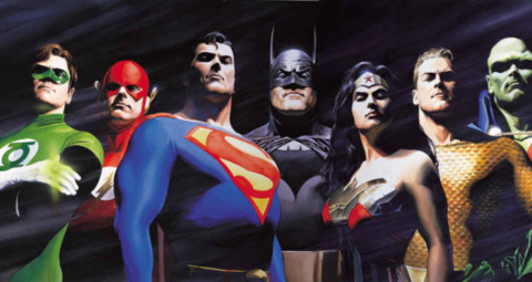
I have some experience with 3D modeling and animation.

As a general rule you have to avoid strong shadows if you want your work to look realistic.

Alex Ross' art is a great example.

No Caption Provided

____________________________________________________________________________________________

This painting implies they're all in a dark room and there is a single light source in the front left. Thus casting strong shadows because there is no light reflection from below.

As soon as they go outside, light starts to reflect from the floor, near objects, etc. Thus, softening the shadows.

Avatar image for loyngulpany
loyngulpany

3684

Forum Posts

0

Wiki Points

0

Followers

Reviews: 0

User Lists: 0

@bruceveidt: Well, tbh I prefer the cartoonish art style of comics over realistic one. Realistic looks like a painting from painters like Michaelangelo, Da Vinci etc. Not saying realistic art is bad though it's still great but that can't be applied to filmmaking. Let's go back to color grading. It's okay to embrace the flat and dull look if you want to but if you're dealing with a giant superhero movie don't you want this to be colorful or vibrant?? The thing is color grading doesn't have to be oversaturated or desaturated to make it good. That's why most music videos these days tend to look grayish when they used to look vibrant and exciting.

Avatar image for loyngulpany
loyngulpany

3684

Forum Posts

0

Wiki Points

0

Followers

Reviews: 0

User Lists: 0

@bruceveidt: If you wanna know about the thing I said about music videos watch Linkin Park's Heavy and compare that to Avril Lavigne's Girlfriend. Look how much different the color grading of those music videos.

Avatar image for loyngulpany
loyngulpany

3684

Forum Posts

0

Wiki Points

0

Followers

Reviews: 0

User Lists: 0

@bruceveidt: If you want to know my point just watch Patrick Willem's video "Why Do Marvel's Movies Look Kind of Ugly?". Color grading isn't just the real problem of the MCU movies. It's also the generic unmemorable scores

Avatar image for bruceveidt
BruceVeidt

3570

Forum Posts

0

Wiki Points

0

Followers

Reviews: 0

User Lists: 0

#41  Edited By BruceVeidt

@loyngulpany said:

@bruceveidt: Well, tbh I prefer the cartoonish art style of comics over realistic one. Realistic looks like a painting from painters like Michaelangelo, Da Vinci etc. Not saying realistic art is bad though it's still great but that can't be applied to filmmaking. Let's go back to color grading. It's okay to embrace the flat and dull look if you want to but if you're dealing with a giant superhero movie don't you want this to be colorful or vibrant?? The thing is color grading doesn't have to be oversaturated or desaturated to make it good. That's why most music videos these days tend to look grayish when they used to look vibrant and exciting.

I used Alex Ross' painting as an example of how light behaves inside a dark room. In the outside there would be no strong shadows.

As for your question, i guess it depends on the tone of the movie.

TDK trilogy has a more washed out/less vibrant color grading, it helps set the tone of the movies. The same happens with Watchmen. These are movies with a more serious tone.

Having more vibrant colors would fit in Thor: Ragnarok since it's an action comedy. Spiderman: Homecoming would benefit, too.

The thing with the trend on color grading is maybe due to having much better video technology today as compared to, say, a decade ago. You lose detail when increasing shadows. So having a more washed out color grading can allow seeing more details in your 60" 4k tv.

Avatar image for bruceveidt
BruceVeidt

3570

Forum Posts

0

Wiki Points

0

Followers

Reviews: 0

User Lists: 0

@bruceveidt: If you want to know my point just watch Patrick Willem's video "Why Do Marvel's Movies Look Kind of Ugly?". Color grading isn't just the real problem of the MCU movies. It's also the generic unmemorable scores

I think i have seen that video.

And yes, i have always thought the generic scores are what make the MCU movies kind of "meh" to me.

Avatar image for loyngulpany
loyngulpany

3684

Forum Posts

0

Wiki Points

0

Followers

Reviews: 0

User Lists: 0

@loyngulpany said:

@bruceveidt: Well, tbh I prefer the cartoonish art style of comics over realistic one. Realistic looks like a painting from painters like Michaelangelo, Da Vinci etc. Not saying realistic art is bad though it's still great but that can't be applied to filmmaking. Let's go back to color grading. It's okay to embrace the flat and dull look if you want to but if you're dealing with a giant superhero movie don't you want this to be colorful or vibrant?? The thing is color grading doesn't have to be oversaturated or desaturated to make it good. That's why most music videos these days tend to look grayish when they used to look vibrant and exciting.

I used Alex Ross' painting as an example of how light behaves inside a dark room. In the outside there would be no strong shadows.

As for your question, i guess it depends on the tone of the movie.

TDK trilogy has a more washed out/less vibrant color grading, it helps set the tone of the movies. The same happens with Watchmen. These are movies with a more serious tone.

Having more vibrant colors would fit in Thor: Ragnarok since it's an action comedy. Spiderman: Homecoming would benefit, too.

The thing with the trend on color grading is maybe due to having much better video technology today as compared to, say, a decade ago. You lose detail when increasing shadows. So having a more washed out color grading can allow seeing more details in your 60" 4k tv.
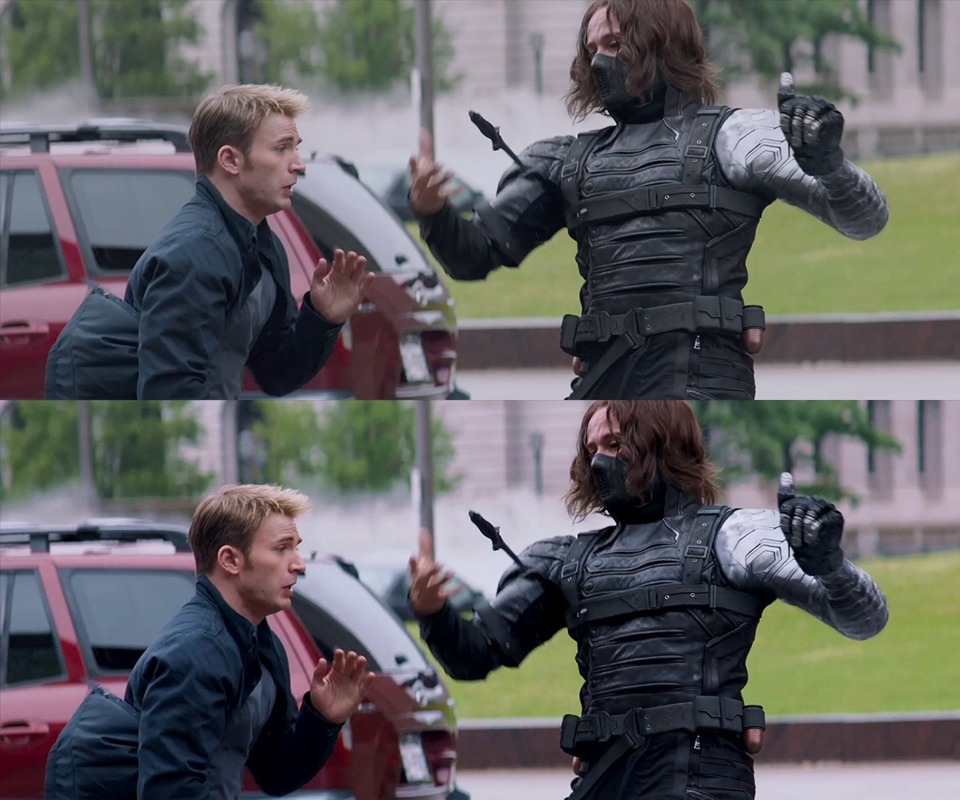
Ummmm... No TDK trilogy has vibrant color grading even if the movie was dark. It has more contrast than any MCU movie. Look at the night scenes you can see clearly because the image doesn't look washed out. Even Logan and Watchmen has vibrant colors.

Avatar image for mickey-mouse
mickey-mouse

37138

Forum Posts

1

Wiki Points

0

Followers

Reviews: 1

User Lists: 4

@loyngulpany: The first 2 Star Wars Movies are pretty serious. The 3rd turns into a cartoon once the Ewoks waltz in. The first 2 prequels were heavily criticized for being cartoony and goofy. And most of the whiney fanboy crowd including myself hate the current direction of the Star Wars films so...

All of he LOTR Films are serious and the Last 2 Films have a dark gray based color palette not bright and hopeful.

Adults want to imagine and be able to relate to more realistic colors even if everything happening on screen is other worldly. The problem with the DCEU is that the characters are so divorced from reality that the dark moody pallete comes off as pretentious. Where as with The MCU the pallete is juxtaposed with the humor and light hearted MCU.

Avatar image for heroup2112
HeroUp2112

18447

Forum Posts

0

Wiki Points

0

Followers

Reviews: 0

User Lists: 0

I´m no expert, but I can say that the first two don´t look good or natural

Only the third.

Avatar image for loyngulpany
loyngulpany

3684

Forum Posts

0

Wiki Points

0

Followers

Reviews: 0

User Lists: 0

No Caption Provided

Avatar image for loyngulpany
loyngulpany

3684

Forum Posts

0

Wiki Points

0

Followers

Reviews: 0

User Lists: 0

#47  Edited By loyngulpany

@mickey-mouse said:

@loyngulpany: The first 2 Star Wars Movies are pretty serious. The 3rd turns into a cartoon once the Ewoks waltz in. The first 2 prequels were heavily criticized for being cartoony and goofy. And most of the whiney fanboy crowd including myself hate the current direction of the Star Wars films so...

Well technically that's because of the bad CGI not color grading.

All of he LOTR Films are serious and the Last 2 Films have a dark gray based color palette not bright and hopeful.

The color grading is still vibrant not grayish and dull..

Adults want to imagine and be able to relate to more realistic colors even if everything happening on screen is other worldly. The problem with the DCEU is that the characters are so divorced from reality that the dark moody pallete comes off as pretentious. Where as with The MCU the pallete is juxtaposed with the humor and light hearted MCU.

Although I can agree that the DCEU has desaturated colors but still there are proper black values and contrast. The only DCEU movies without a dark palette are Wonder Woman and Justice League.

Look at this shot:

No Caption Provided

Notice that they used blue and green color palette in this movie?

Avatar image for mickey-mouse
mickey-mouse

37138

Forum Posts

1

Wiki Points

0

Followers

Reviews: 1

User Lists: 4

@loyngulpany: You’re not wrong on WW, but need I remind you it’s the only DCEU movie that’s actually happening in what we would consider the “real world” it’s grounded in WW2. And Patty Jenkins is a pretty sensible director. I love MOS. But, I didn’t like Zacks color choices.

Avatar image for loyngulpany
loyngulpany

3684

Forum Posts

0

Wiki Points

0

Followers

Reviews: 0

User Lists: 0

@loyngulpany: You’re not wrong on WW, but need I remind you it’s the only DCEU movie that’s actually happening in what we would consider the “real world” it’s grounded in WW2. And Patty Jenkins is a pretty sensible director. I love MOS. But, I didn’t like Zacks color choices.

I also didn't like Zack Snyder's desaturated colors.

Here take a look at what will happen if Snyder directed Shazam:

No Caption Provided

Avatar image for emperorthanos-
emperorthanos-

19402

Forum Posts

0

Wiki Points

0

Followers

Reviews: 0

User Lists: 0

#50 emperorthanos-  Moderator  Online