
Best/Worst DC Covers – May 2013
By MSchiwal 9 Comments
Judging books by their covers because they get paid to do it and I am bitter as hell!
Dishonorable Mention

World’s Finest: Oh hey look, Huntress hurt on a WF cover, that’s totally new! Okay, the main reason this gets on here is the return of the Power Girl Boob-Window costume. While I hate the current Power Girl costume because it does not flow in anyway and the nipple circle that is sometimes going on(because the art is way inconsistent on her P). The answer is NOT to return to the Boob Window… hell you could easily have returned to this and had that part filled in! Hell you could just fill it in with a circle and her current P logo, it would have been fine. The only reason this stayed off the list proper is because the art itself is gorgeous.
Five Worst Covers

Nightwing: Help! Someone put masking tape X’s over my mask and I can’t see!

Phantom Stranger: Not a single facial expression works here… not one.
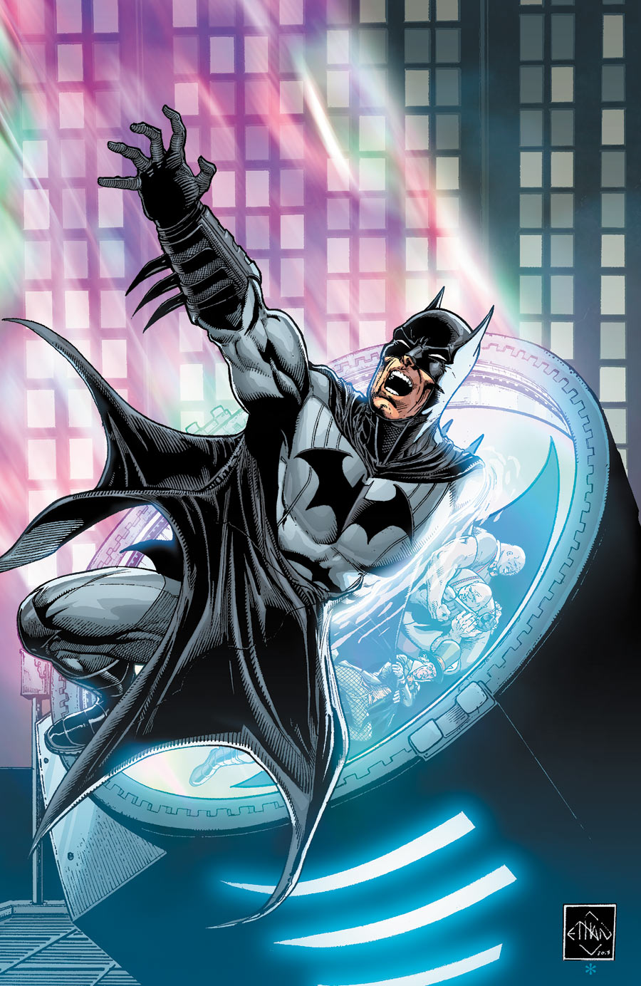
Batman: The Dark Knight: This is just bad art. I feel like a more competent artist could have made this idea work with a more interesting composition, but this falls flat… actually it falls further than flat into the mirror-verse and becomes talf… that is how bad it is.

Justice League of America: I AM GONNA SMOOSH YOU TWO INTO THE SAVAGE MANHUNTER! Okay I really hate the generic photoshop clouds with filters for the background(its unforgivable with professional artwork)… This one gets this spot for the amount Selina’s suit is unzipped. It is literally at her navel. I have seen parodies of her zipper troubles that were more zipped up and exposed less tits. Seriously, don’t they have editors for this? Or did they want one of their premiere female characters unconscious on the ground with her top mostly off… god I hate DC somedays…

Legends of the Dark Knight: Look I generally give the online comics a pass as they are almost always less refined than the stuff that goes to stores… but come on WHAT THE HELL ARE UP WITH HIS LEGS! Seriously, even with the more cartoonish style the proportions are so off that it hurts me deep inside. Its like Batman tripped onto a wormhole to the Uncally Valley so hard that lightning shot out and all the bones in his lower half liquidated. When Mr. Fantastic shows more restrained proportions and realism its time to scrap the sketch and start the hell over.
Ten Best Covers
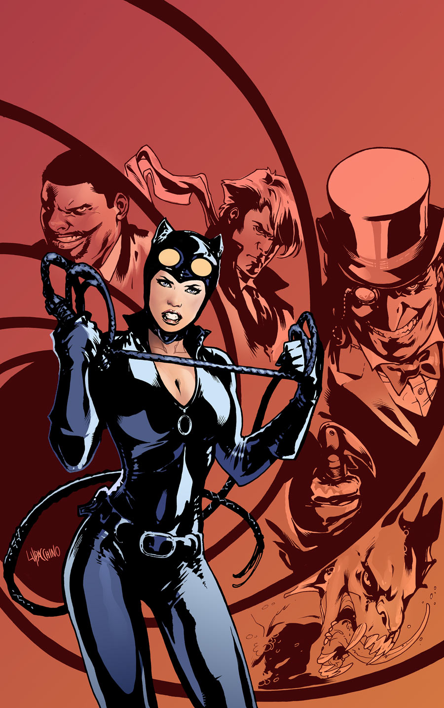
Catwoman Annual: An interesting, well composed cover from Catwoman. I am pleasantly surprised! It is dropped down to number ten due to its zipper fail… but still a good cover overall.

Batman: The Dark Knight: As much as I hate this series(its a lot. it is like flames on the side of my face), I really enjoy this cover. Batman perched on the side of Arkham and the inmates inside are all really well drawn. Kudos.

Batman and Robin: At first I was shocked that Red Hood managed to get such an amazing cover drawn… then I noticed it was for Batman and Robin, so the world still makes sense. This is just great, the simple colors of Batman, the reds of the hood standing out but still desaturated enough to not pull away all the attention, the detailing on the mask’s little pieces. Really, really strong cover.

Animal Man: Hell Yeah, Buddy Baker! I am totally digging the new Animal Man cover artist and this one is great. It really does a good job of illustrating the disconnect of Buddy between superheroics and the real world that is present in his life. Huge points for him mirroring the movie poster without using the same pose cut and pasted. Also points for the Man of Steel easter egg!

Wonder Woman: Cliff Chiang I would totally give you my baby but you already have one. This is great, actually all the Wonder Woman covers have knocked it out of the park and this one is as strong as its protagonist.

Batman: Capullo… Seriously I could nearly forgive all the bad DC has down with the 52 because of Snyder/Capullo on Batman. This is a gorgeous cover with a simple composition yet a lot of detail.

Batwoman: Batwoman has amazing covers… always. It is her superpower. This one is actually one of my least favorites as I feel her hair is a bit off and overall it may be trying to have too many things happening. However it is still a really gorgeous piece.

Batman Incorporated: Wow. Normally I really dislike Batman Inc.’s covers (the squareness of Batman’s jaw is ridiculous) This however is just great. I love the woodcut Paradise Lost-esque backdrop. Talia looks amazing and powerful… however my only nitpick is just how utterly shear that fabric is… Honestly I can forgive it due to the statuesque form she is given here, but it still bothers me.

Suicide Squad: I had two thoughts upon seeing this: Wow I can’t believe we got such a powerful yet simple cover from Suicide Squad! and Wow! I can’t believe we are getting a cover without shoving Harley’s tits in our face! Seriously, if that is her blowing up on the cover and she is dead forever I would be fine with it… fucking 52 and its universal slut mandate.

Swamp Thing: Yes, this… all of this. Swamp Thing is losing Snyder and gaining some of the best cover illustrations at DC. I love the detail in Swamp Thing. The contrast between colors and the playfull-ness of the reds? Its brilliant. The whole bloody thing is brilliant.
______________
Be sure to leave a comment if you would like to see more cover commentary next month.