
GS Top 5: Least Favorite 5 Cyclops Costumes
By god_spawn 16 Comments
Someone in my recent Top 5 Wolverine Costumes list mentioned my Cyclops one and I just decided to re-read through it for shiggles and was sparked by inspiration of my least favorite Cyclops costumes. So after some research and self-reflection I decided why not? Cyclops is a character that has had some really good, really bad, and some really polarizing costumes. If you want to check out my 5 Favorite Cyclops costumes, I will link that here. I've always felt almost like an outsider amongst Cyclops fans because I genuinely don't feel like my opinions of the character match the majority of what I see as the common general answers in certain things, so as I was making this list I fully expect some "negative" feedback. So let me remind you, this is all subjective. So let's get to it.
5. Jim Lee Era
Dropping bombs right away. Created by Jim Lee and Chris Claremont, debuting in X-Men Volume 2, issue 1. This outfit of Cyclops is arguably the most iconic costume and is regarded as the quintessential outfit for Mr. Scott Summers. But guess what? I never found the appeal. I don't actually hate this costume but it's kind of...meh to me. Between the solid blue spandex, the banana yellow trunks on the outside, the thick gold pirate boots, gloves, and the belt and strap combo just always looked kind of silly to me. The gold visor also always looked kind of clunky to me too. And there seems to be some weird obsession with a certain niche of Cyclops fans have about the "chestnut/chocolate brown hair flowing free. I don't get it. This isn't a bad outfit by any means. It is a very 90's outfit, but it just never appealed to me. I'd actually say Larocca did it better, which is on my top 5 favorite Cyclops outfits and why I believe so.

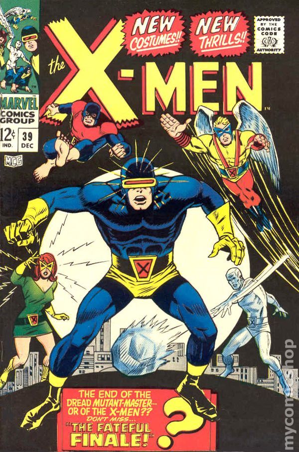
4. Classic Blue
The first individualized costume that Scott received from Xavier in X-Men #39. Created by Stan Lee and Don Heck, this to me is one of the cases that I agree with the full body outfit not working. I made a case in my other list or in another thread that I actually like a lot of the "head condom" outfits but they are very much based on the actual color scheme and design. This is one of the ones that while an early costume I don't feel aged very well. It's basic in it's color scheme with the solid blue...full body spandex. It has the same problems I had with the Jim Lee costume with the banana yellow underwear, boots, gloves and visor. To me I feel like the best full body costumes Scott has are the ones that are streamlined like his Astonishing outfit or the Revolutionary one, as controversial and deviating that one was, it just flowed better. This one, like the Jim Lee design, are just too bulky in appearance and seem thrown together. It's a classic costume, but I can't say it's a good one outside of nostalgia.
3. New X-Men
Debuting in Grant Morrison's and Frank Quitley's "New" X-Men 114, this costume itself was very much a big detraction from Scott's usual body spandex outfits, and Frank drew him well...very slim. I will say I think Grant Morrison's X-Men run will go down as one of the top 3 runs of all time. What I will say though is the artwork was very inconsistent to me. I think some panels were done very well but I think Quitley really took Scott's nickname a bit too far. Everything from Scott's build to the shape of his face was slim. The visor itself was not a good change up, IMO, after years of clunky looking gold ones to barely a thin strip running across his eyes. The outfit itself didn't really scream hero and I know Whedon made a remark about returning to the superhero look in Astonishing right after. This outfit to me was more suitable for Wolverine. This is something I can see Cyclops ordering a hot dog and swinging by Jean's at 6 vs saving a child from a burning building. Between inconsistent artwork and I think the concept itself, it just didn't work for me, but on an aesthetic level, I'd say it's not his worst. It worked for the story, though.

2. O5
And back to the classics and this is as classic as it gets. This is Scott's first costume and I hated it. The dark blue/ sometimes black depending on the take, with the yellow, the thick boots, and visor looking like it grew from Scott's face, I don't like the outfits. It's very generic looking and makes him look like some fodder goon of some bad guy's gang vs a superhero.

1. Honeymoon Outfit
Digging deep on this one guys, but holy shit was it bad. Appearing only 1 time did this legendary outfit ever appear. Debuting and ending in X-Men #35 by the creative team of Fabian Nicieza and Liam Sharp. We're going to give Scott a dark blue outfit, orange shoulder pad like sleeves, a chin strap, the thickest visor we can and a tape measure going over his head. Make him look like he was a defensive lineman from back in the day and decided to bust out the old game clothes to see if he can still fit on his honeymoon years later. It's a bad one and definitely a good thing this costume never saw the light of day again. I don't think we needed Scott to look like he was going to cut an 80's WWF promo on Ricky Steamboat or something.

There you have it, folks. My least 5 favorite Cyclops outfits. I know I'm committing heresy with some of these but oops. Maybe I want to watch the fandom burn? But I would never do something like that. As usual, feel free to comment, hate, thumbs up, make your lists, comment and whatever below. Thanks for reading and I'll catch you guys next time.
16 Comments