Like the title says ^__^
Check out the different designs below.
Character » Aquaman appears in 4624 issues.

Like the title says ^__^
Check out the different designs below.


I don't understand...I clearly remember looking at this thread earlier....now it's a 404 error and you're remaking it....why?
@danhimself: I was missing some of the designs in the Modern Age timeline. the bottom two designs are the ones I've applied to the voting poll. thanks again for deleting your earlier post bro...now you can make a vote on which designs the best.

Ehh for me it's a mixture. Jim Lee looks with Ivan Reis hair, no sideburns. And i've always liked Gleasons water hand.
@Joygirl said:
Admittedly, while the art is subpar, I like the DESIGN of Craig Hamilton's. Will likely be an unpopular opinion but I enjoyed harpoon-hand savage Aquaman. Also I would like to point out that Jim Lee's looks a LOT like Catman.
I made an error on the images and the specific penciler, but it has since been fixed after I noticed the misconception.
Craig Hamilton's Aquaman came from the 4-part mini series they had after Crisis of Infinite Earths depicted in the pic below.
@Veshark: Both, I was going to post up both of his suits, but this one seemed more appealing. However, I'll post up the other one jus cause you mentioned it.
@Veshark: Loved the story arcs Aquaman played a main role in, especially Rock Of Ages. His appearance in the series was a complete masterpiece. Obsidian Age and the story line where the JLA battle the likes of the Ultra-Marines corps were also my favorites during his "harpoon" adventures with the JLA. It was JLA #24-26 of Morrison's series.
@ckuakini
Oh yeah, definitely. Morrison really wrote a strong portrayal of Aquaman, a tough rebel yet a loyal friend. I think JLA was one of the first comics to really turn me on to Aquaman as a character.
One of my favorite moments in the World War III arc was when Aquaman confronted a bunch of light-based villains (Dr. Light, Crazy Quilt etc) during a prison breakout: "My eyes are adapted to see at 20,000 fathoms. Most of your powers are dependent on light." Then the lights go off. "Think about that."
Awesome :D
@Veshark said:
@ckuakini
Oh yeah, definitely. Morrison really wrote a strong portrayal of Aquaman, a tough rebel yet a loyal friend. I think JLA was one of the first comics to really turn me on to Aquaman as a character.
One of my favorite moments in the World War III arc was when Aquaman confronted a bunch of light-based villains (Dr. Light, Crazy Quilt etc) during a prison breakout: "My eyes are adapted to see at 20,000 fathoms. Most of your powers are dependent on light." Then the lights go off. "Think about that."
Awesome :D
hahah those panels were a complete classic. That was just Aquaman showing some humor. However, CV's not letting me post up the images of Aquaman with his harpoon and silver armory for some reason. Do you have any scans or pictures of him while rocking his bearded appearance?
@Veshark said:
@ckuakini
Sadly no, but it's easy enough to copy-paste images from Google:
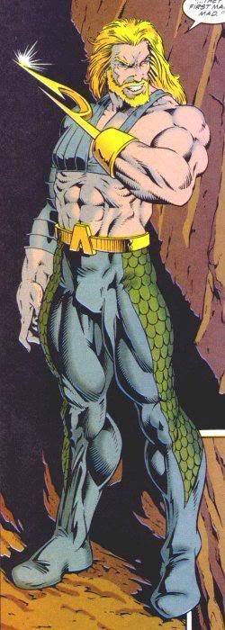
It's surprisingly hard to find the hook Aquaman drawn by Howard Porter...
yea it is..Martin Egeland was known most widely for this design, which makes it's harder to find the other images of the other artists; more so, jus trying to find Egeland's Aquaman.

They're all inferior to Emperor Joker Aquaman.

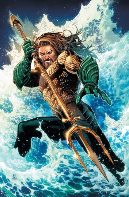
Jim Lee's design. I'd love it more if he had a beard.

For me, it's a tie between Gleason and Lee... Gleason's waterhand aquaman was awesome, but Lee's bearded look makes aquaman look more badass, i even dig the side burns. Reis' is cool too, but i feel it's too clean cut. Pelletier's aquaman looks similar to Reis' aquaman, only difference i see is that Pelletier gives aquaman a bigger nose 0.0

I like Jim Lee's the best, but I rally like Reis' and Pelletiers', as well. They look very similar, and it's really just their art styles that are different, though.
@Squalleon: they collaborated on the cover. But here's more specific scans of Paul Pelletier's Aquaman:

As of right now, I'm liking the collaboration of both Paul Pelletier and Sean Parsons working artistically on the Aquaman title. Some of the panels are really sick like the page of ancient King of Atlantis (maybe Poseidon), which is very detailed with some of the very deep colors Parsons brings to the table.

Really enjoyed Martin Egeland's Aquaman when he was drawing for the character while Peter David was writing for him.

Between Ivan's and Howard Porters.
honorable mention to Craig and Jackson's


This one.

Did someone beat me to it? Guess not...


This one.
I'm with you on that.


I vote Ivan Reis's modern design.
Not a fan of the Wolverine sideburns on Lee's design.

The Ivan Reis design for the new 52 is the definite AQ visual representation.
Apart from that I Martin Egeland's harpoon hand design (also posted in this thread) was also classic.


I personally hate Aquaman's long hair+hook hand look.
Please Log In to post.
This edit will also create new pages on Comic Vine for:
Beware, you are proposing to add brand new pages to the wiki along with your edits. Make sure this is what you intended. This will likely increase the time it takes for your changes to go live.Until you earn 1000 points all your submissions need to be vetted by other Comic Vine users. This process takes no more than a few hours and we'll send you an email once approved.


Log in to comment